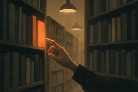
Every indie author has had that moment staring at a finished manuscript, proud of the words inside, but staring even longer at a design that just doesn’t match up. A strong story can stumble before it even gets opened if the presentation screams “amateur” instead of “market-ready.”
That’s because readers really do judge a book by its cover. That’s not a cliché, it’s a sales reality. Walk through any bookstore or scroll through an online catalog, and you’ll see how quickly your eye skips past certain titles. Often, it isn’t the writing quality turning readers away; it’s the packaging.
For self-published authors, the temptation to “do it yourself” or grab something quick from a template is understandable. Budgets are tight, and design tools can feel intimidating. But here’s the catch: the wrong choices silently eat away at reader trust and conversions. These design mistakes aren’t always loud, but the consequences are.
The good news? Avoiding them doesn’t require Hollywood budgets or years in art school. It just takes awareness, smart shortcuts, and a clear understanding of what actually sells. This article lays out the most common design mistakes indie authors keep repeating, and how to avoid them without draining your bank account.
Bad design mistakes cost more than a few eye-rolls; they cost sales. Readers don’t always articulate it, but they sense when a cover feels off. Maybe the font spacing looks clumsy, maybe the color choices clash, maybe the image feels like it came straight from a free stock library. Each of these sends subtle signals that override even glowing reviews.
Think of it like online dating profiles. A sharp bio won’t matter much if the first photo looks blurry or fake. The same goes for books; your cover is the first impression, and readers don’t give second chances.
The “good enough” mindset is one of the most expensive design mistakes an author can make. A cover that looks fine to its creator can appear unpolished to buyers who compare it to the latest award-winning book covers in their genre. When the subconscious impression is “cheap” or “unfinished,” readers assume the writing might be the same.
Readers want to believe their money and time are going into something worth it. That’s why a strong cover, professional typography, clear imagery, and genre alignment can bring more conversions. A weak one quietly tanks them.
Indie authors often learn this lesson the hard way. The hidden cost of DIY shortcuts isn’t just lost clicks; it’s lost credibility. The difference between “good enough” and “marketable” is the difference between selling a few copies to friends and building steady sales with strangers. And while plain book covers can sometimes work for minimalist genres, for most indie authors, a cover that doesn’t compel a reader to pick the book right off the shelf is just another silent sales killer.
Typography is the silent killer of indie covers. A poorly chosen font or sloppy layout can make an otherwise promising design look like a high school project.
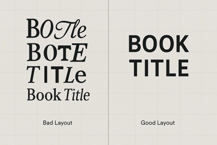
Unreadable scripts might look “fancy” to the author, but they turn off buyers who just want to know the title. Romance and fantasy thrive on flair, but even in those genres, readability is necessary. Likewise, fonts that look like they came straight from Microsoft Word fail to impress the reader.
When the title, subtitle, and author name are all competing for attention, readers don’t know where to look. On bestselling thrillers like The Silent Patient, the hierarchy is crystal clear: title first, author second. That order builds recognition and trust. Indie covers that miss this step often drift into the trap of plain book covers, technically readable but lacking the punch to hook browsers.
Uneven kerning, awkward line breaks, and misaligned text are a clear sign of poor design. Even readers who can’t explain why will sense something is “off.” Think of it like punctuation in writing. Most people can’t define a semicolon, but they know when it’s used wrong.
These subtle design mistakes stack up quickly, and readers turn away before tilting the book to read the back cover.
Start by choosing fonts relevant to your genre, but stay legible across all sizes. Serif or clean sans-serif typefaces work best due to their adaptability in both print and digital thumbnails. If you want style, use it sparingly in the title or a single accent word, not across every line.
Next, establish a visual hierarchy before you even start designing. Decide what the reader should notice first. The best approach is usually the book title, but scale or weight it accordingly. Keep the subtitle supportive and the author’s name clearly visible but secondary. You can test hierarchy by zooming out: if the title still reads clearly at 10% size, it’s perfect.
For spacing and alignment, use grid systems or alignment guides in your design software. Pay attention to kerning (the space between letters) and line spacing for easy readability. Aligning all text elements to a single axis gives the design a clean, professional feel.
Color works on a subconscious level, guiding buyer emotions before a single word is read. However, indie authors often underestimate the impact that color can have on making or breaking a book cover design .
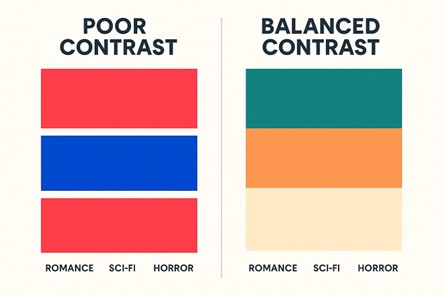
A common mistake is combining colors with conflicting temperatures, like pairing overly saturated reds with electric blues. On screens, this creates visual vibration, making the design hard to focus on. Instead of drawing the eye, it pushes it away.
Many covers fail because the brightness levels between text and background are too similar. Even if the colors are different, the title disappears in grayscale or small thumbnails. Designers call this a contrast ratio problem — and it directly affects readability across devices.
Each book genre has an established visual temperature. Horror often relies on deep shadows and muted tones; romance thrives on warm, soft gradients; sci-fi frequently employs cool blues or metallics. When an author ignores these visual conventions, the color scheme feels “off” to readers, even if they can’t explain why.
The solution to poor color choices starts with understanding color psychology and visual balance. So, select a limited palette, for example, two dominant colors and one accent, as per your book’s tone and genre. Use the color wheel as your guide: complementary colors like blue and orange create strong contrast, while analogous shades like teal and green feel calm and cohesive. Always test contrast ratios to make sure your title stands out clearly in thumbnails and print.
For example, The Girl on the Train by Paula Hawkins uses dark, muted blues with stark white text. This color combination feels tense and thrilling, all while maintaining legibility across all sizes. Even a small book cover in a crowded search result can stand out if its colors are sharp, readable, and genre-appropriate.
Images can be the biggest trap for indie authors. A poor stock choice can doom a cover instantly, no matter how strong the story inside.
We’ve all seen them: the brooding man with abs, the girl staring into the distance, the same castle photo reused across ten fantasy titles. These scream “template cover” and make readers roll their eyes. Worse, when your book cover name is plastered on a picture readers have seen elsewhere, the message is “cheap” instead of “unique.”
Authors often try to show everything at once: dragons, castles, lovers, explosions. The result? Chaos. Without a clear focal point, the design looks like a poster for five different stories jammed together. A small book cover shrinks this problem further; what looked “epic” in Photoshop just turns into an unreadable blob in thumbnail view.
Stretched, pixelated, or badly cropped images look careless. Even strong typography collapses when the visuals look like they were rushed.
The easiest way to avoid image and composition mistakes is to treat your cover like a visual summary of your story, not a collage of scenes.
Skip the overused stock photos you’ve seen on a dozen other books. Select images that best describe your story, not every detail. Keep one clear focal point and let white space bring focus to it. Always use high-resolution images (300 DPI for print) and never stretch or distort them to fit. Before finalizing, shrink your cover down to thumbnail size. If it still looks clear, you’ve nailed the composition.
Layout is where good intentions often fall apart. Even with the right fonts, colors, and images, sloppy placement can ruin credibility.
Many amateur layouts ignore the visual hierarchy grid, causing one corner of the cover (usually the top left) to carry all the weight. Without a centered or rule-of-thirds alignment, the eye has nowhere to rest. This imbalance makes even good imagery look awkward and unprofessional.
When the title or author name sits too close to the edge, it breaks print safety margins (typically 0.25 inches). Uneven spacing between lines or inconsistent leading (line spacing) creates tension that readers subconsciously read as “cheap design.”
Elements placed without using baseline grids or guides often end up just a few pixels off, which is enough to destroy cohesion. Misaligned text boxes or centered text over asymmetrical backgrounds confuse the eye and make the cover feel poorly structured.
Many indie authors pour energy into the front, only to ignore the spine and back. A misaligned spine stands out like a crooked tooth on a bookshelf, while a blank back cover suggests the project wasn’t finished. Print buyers often see the spine first, so it’s prime real estate, not bonus space.
To avoid layout mistakes, start with a clear grid system. Most professional designers use a three- or four-column grid to keep every element aligned and balanced. Place your title, subtitle, and author name within that grid so they visually connect instead of floating randomly. Keep consistent margins by leaving at least 0.25 inches from every edge to stay print-safe and avoid a cramped look.
Check leading (line spacing) and kerning so the text feels evenly spaced and easy to read. Ensure your main focal point—typically the title or central image—aligns with the rule of thirds for natural balance. Finally, zoom out and view your cover at thumbnail size; if everything still looks clear and structured, your layout is working.
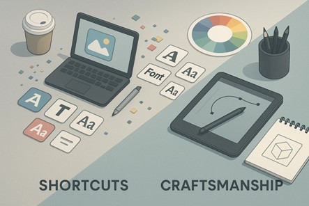
DIY isn’t the enemy, but careless DIY is. Too many indie authors cut corners, only to pay later in lost sales and credibility.
Canva and AI cover generators are great starting points, but most users stop at the template. The problem is that those same layouts and fonts appear on hundreds of other books. Without adjusting typography, spacing, or imagery, your cover ends up looking mass-produced. Always personalize the design by changing font weights, color palettes, and layer effects to connect it with your story, rather than the template.
Even if you’re designing on your own, get a second set of eyes. A professional designer or even a seasoned reader can spot issues you’ve overlooked, like poor contrast, off-center text, or uneven alignment. This review step is where amateur covers become polished.
Many indie authors choose visuals and fonts they personally like, forgetting that the cover’s job is to sell, not to satisfy the creator’s taste. A pastel romance font on a dark thriller confuses buyers instantly. Study genre conventions, what readers expect visually, and design to meet those cues while keeping your own style subtle and intentional.
Affordable pre-made covers, custom font packs, or commissioning a simple book cover illustration can make a huge difference. Even minimalist book cover artwork crafted by an illustrator or designer will look more professional than a recycled template.
DIY can work, but only if treated as a strategy, not as a shortcut. The goal is to create a book cover design that feels intentional and market-ready, not like it belongs in the bargain bin.
One of the most common print errors indie authors make is misjudging spine width. The spine’s thickness depends on your book’s total page count and the type of paper used. If it’s too narrow, your title text can vanish into the fold; too wide, and it looks off-center on the shelf. Always use your printer’s spine calculator to get the exact measurement before finalizing your design.
Another overlooked detail is the bleed and trim space. Print-ready covers must extend at least 0.125 inches (3 mm) beyond the trim line on every edge to avoid unwanted white borders after cutting.
Keep important text or design elements at least 0.25 inches inside the trim area to stay within the safe zone. This margin ensures your title and author name won’t get clipped during printing. Ignoring these details can make even a beautifully designed cover look amateurish in print.
Color also behaves differently across media. CMYK (Cyan, Magenta, Yellow, Black) is used for print because printers layer ink, while RGB (Red, Green, Blue) is for digital screens, which use light. A vibrant blue in RGB might print as dull gray in CMYK if not appropriately converted. Always design for the correct mode and run a printed proof to confirm color accuracy before mass printing.
For digital formats like Kindle or ePub, the process is simpler since there’s no spine or back cover, just the front. Ideal dimensions are around 1600 x 2560 pixels, optimized for clarity on mobile devices. Focus on strong contrast, large, readable text, and simplified imagery since small details disappear in thumbnails. Treat print and digital as separate canvases with their own visual rules to maintain quality across all platforms.
We can’t ignore the fact that design mistakes aren’t about effort but about misaligned choices. Amateur typography, clashing colors, bad images, and genre mismatch all tell readers something feels off, even when the story itself is strong.
The good news is that these problems can be fixed. With a little awareness and strategy, indie authors can sidestep the pitfalls that sink so many books. Learning the basics of typography, checking genre signals, or investing in an illustrated cover are small adjustments that often deliver outsized results.
A cover isn’t just decoration; it’s a silent salesperson. It convinces browsers to become buyers. It builds trust before the first page is read. And in a crowded marketplace, trust is everything.
Want to avoid losing readers at first glance? Let 360 Illustrations help you avoid costly design mistakes with original, market-ready book cover artwork that sells your story before anyone turns the first page.
Looking for more information? Call us at +1 (855) 521-5040 for quick support!


Have a project in mind? Reach out to us, and we’ll help turn your ideas into stunning illustrations.
Tell us what you need, and we’ll create a custom illustration just for you. Reach out today and let's get started!

Copyright © 2026 360 Illustration House | All rights reserved. Terms And Conditions | Privacy Policy | Refund Policy
